Cleo Ai
Financial health app for millennials. Helping young people to learn and manage their money and avoid overdraft fees.
Tags: UX Design, UI Design, User interviews, Prototypes, Native app, Team, Agile methodology
↓
Project background
Cleo is a VC funded fintech startup based in London, with lots of personality! The mobile app, with its £3+ million users, features a spend tracker, budgeting tools, access to a salary advance and savings support. After initially launching the UK, Cleo realised that they had better market fit in the USA. I joined during this pivot and also at a time when they were starting to prepare for their Series C round of funding.
My role
I worked as a Senior Product Designer in the squad that was focused on the salary advance feature. My squad included one other Product Designer, a UX Researcher, a Project Manager, a Data Analyst, two Backend Engineers and one Frontend Engineer. We were a remote but tight-knit team who would meet for daily stand-ups and weekly team building activities, while working to weekly sprints.
As a Senior Product Designer I was given two areas to lead:
1. An audit of the whole salary advance feature to identify quick wins.
2. Decrease the number of users lapsing from their subscription.
Project #1
Improve the salary advance feature
Step 1:
What is the salary advance feature?
The salary advance feature is a crucial part of the Cleo app. Most Americans live hand to mouth and I was shocked at how close to the breadline many people live. Some users needed help buying gas so they could get to work. Instead of going into overdraft with their bank Cleo offered them a salary advance anywhere between $25 - $250 until their next paycheck came in. Interest free.
The Salary advance is only available to Cleo Plus subscribers. This feature had not been developed since it’s launch over a year ago. It was my job to figure out which areas to focus on to improve, in terms of business goals, quick wins, dev lead times and where the most impact could be made.
Step 2:
Collaborate with US team
First problem I came across was trying to get access to the live app. Cleo’s head office is based in London but their market is in the USA, therefore the UK team was unable to access the US live app.
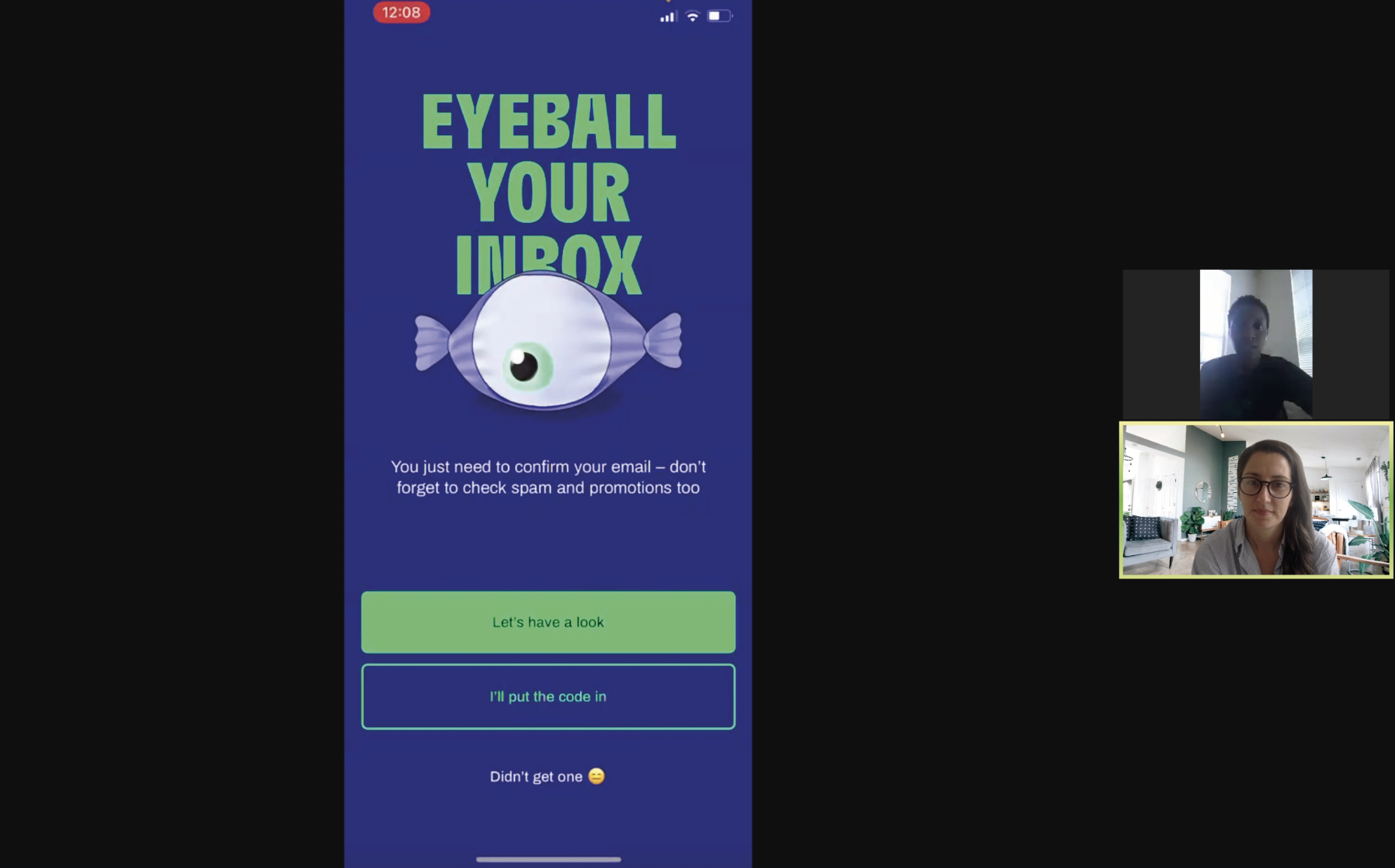
So, to get an idea of what the user journey actually was and to also aid the rest of the UK team, I worked with Cleo’s US customer service team to walk me through the live app so I could then map out the existing user journey and all it’s states.
↑ Zoom calls and app walkthrough with the US team
Step 3:
Map existing live journey
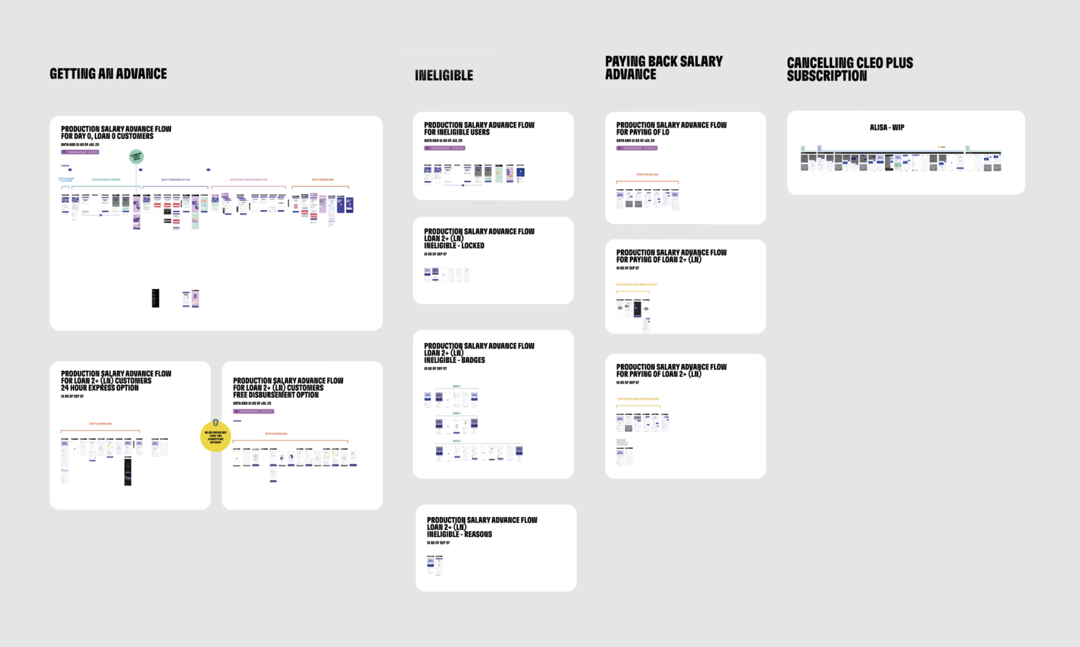
I mapped out the existing user journey and all it’s states in Figma and shared with UK team
↑ Overview of mapped journey in figma
Step 4:
Co-facilitate a squad workshop
Working closely with the squads Project Manager I co-facilitated a squad workshop. The aim of the workshop was to:
Get on the same page
Get the whole squad (developers, designers, data scientists and the PM) all on the same page and familiar with the existing flow and existing user data.Identity core problem areas
Map out what we all consider to be pros and cons of the existing flow and vote on areas we think are best to tackle first.Ideation
Get the whole squad to come up with ideas using the Crazy-8’s method. (Crazy 8’s is a core Design Sprint method from Google’s Design Sprint Methodology . It is a fast sketching exercise that challenges people to sketch eight distinct ideas in eight minutes. The goal is to push beyond your first idea, frequently the least innovative, and to generate a wide variety of solutions to your challenge.)
↑ Clear workshop objectives
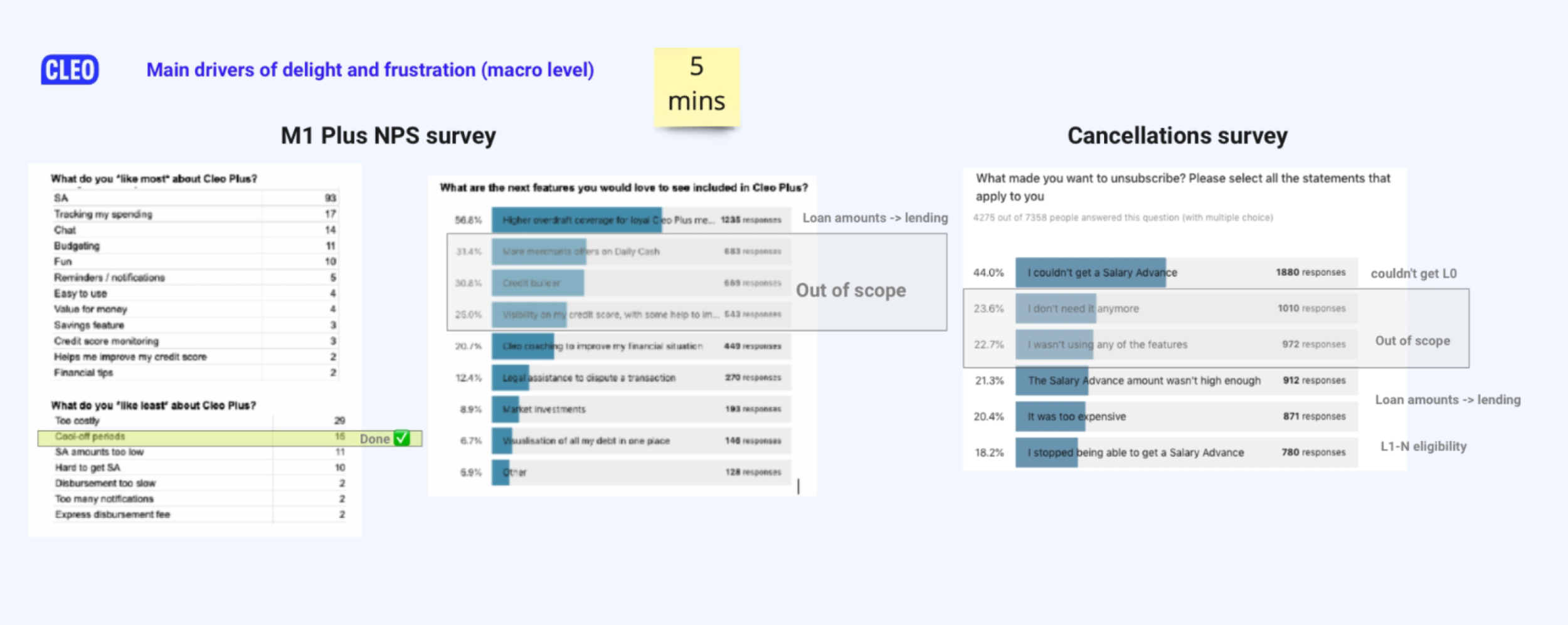
↑ Lead by user data (presented by the project manager)
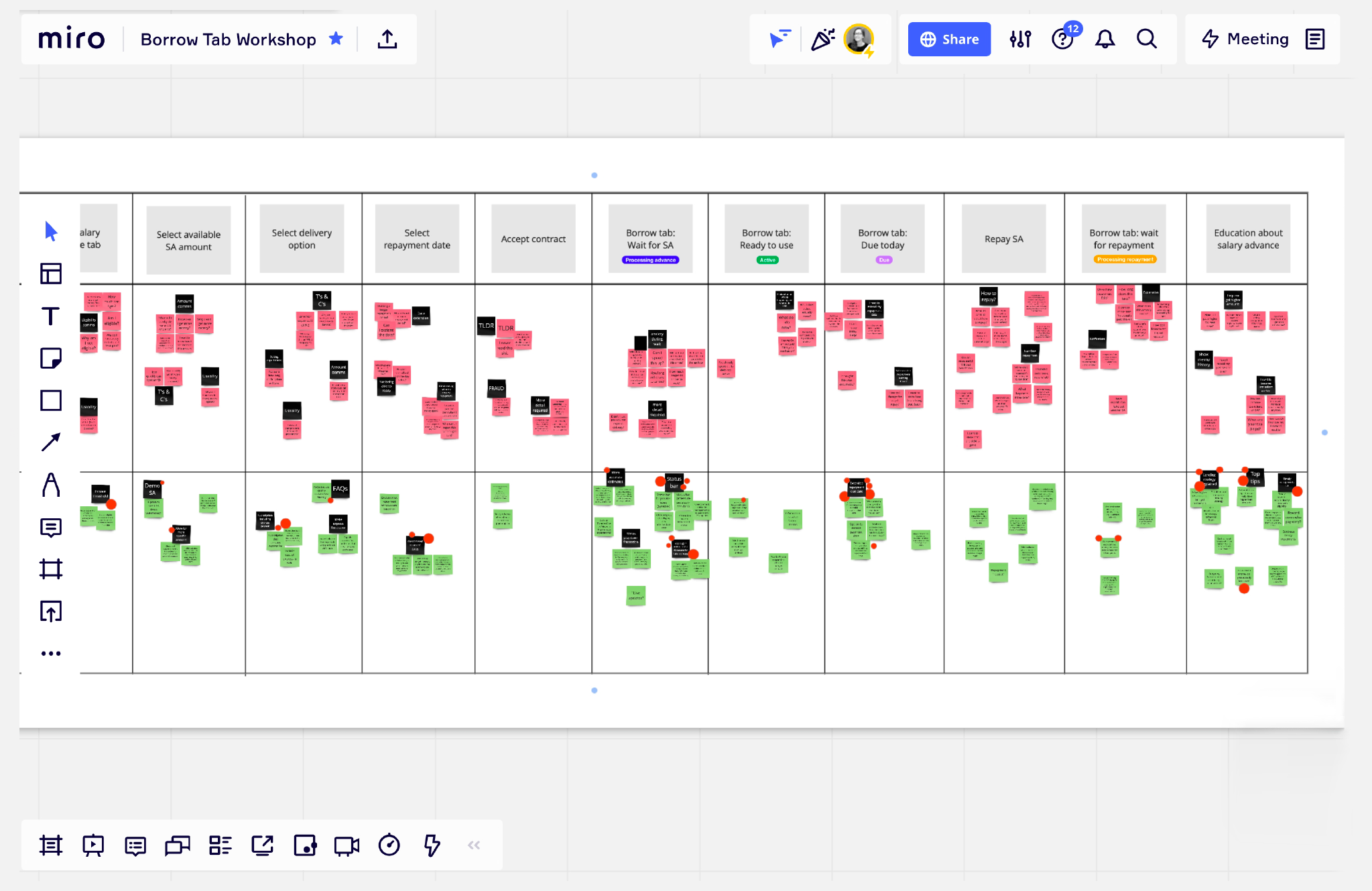
↑ Mapping with the team using post-it notes in Miro the pros and cons of the existing user journey
↑ Crazy 8’s ideas and discussion
Step 5:
Analyse customer service tickets
I spent several days scouring through Cleo’s customer service system - Intercom. I went through and documented tickets related to the Cleo Plus and Salary Advance features.
The idea was to find out what the Customer Service team was being asked about the most, in order to prioritise design fixes and reduce repeated customer service tickets going forward.
I then presented these findings to the rest of the company in our monthly squad updated.
↑ Customer service messages in Intercom related to Salary Advance feature
↑ Presenting my work to the rest of the company
↑ Presenting findings to the rest of the company
Top 3 findings
UX best practices not in place
Poor legibility in areas, broken links, incorrect information, lack of clear CTA’s.
Account issue
Users recieving error messages because their account had been suspended. This was mainly due to having another Cleo account associated with the same or similar email, flagging the system and blocking a salary advance.
User eligibility
Users were not eligible for a Salary Advance but they did not know, or why they were ineligible or how to become eligible.
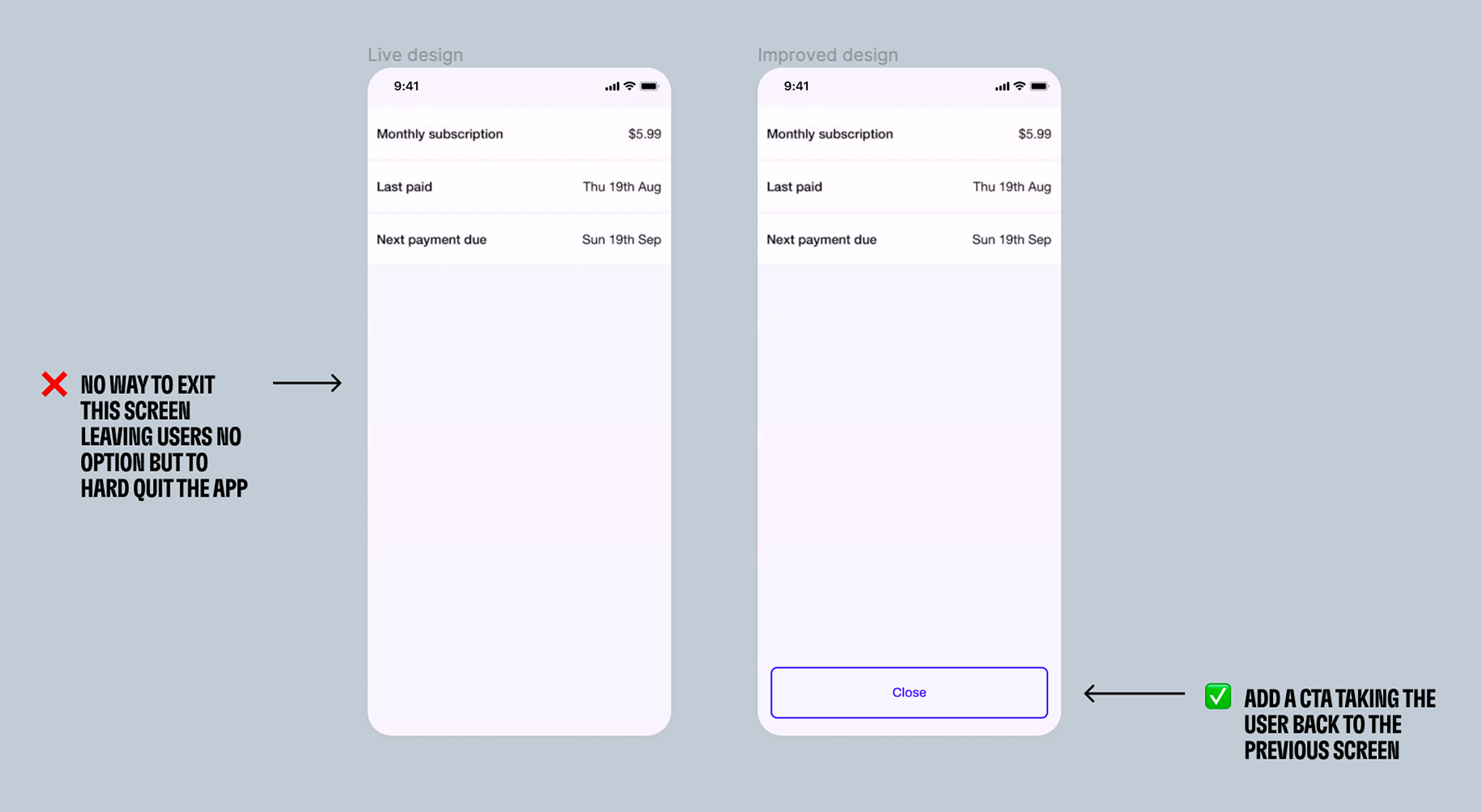
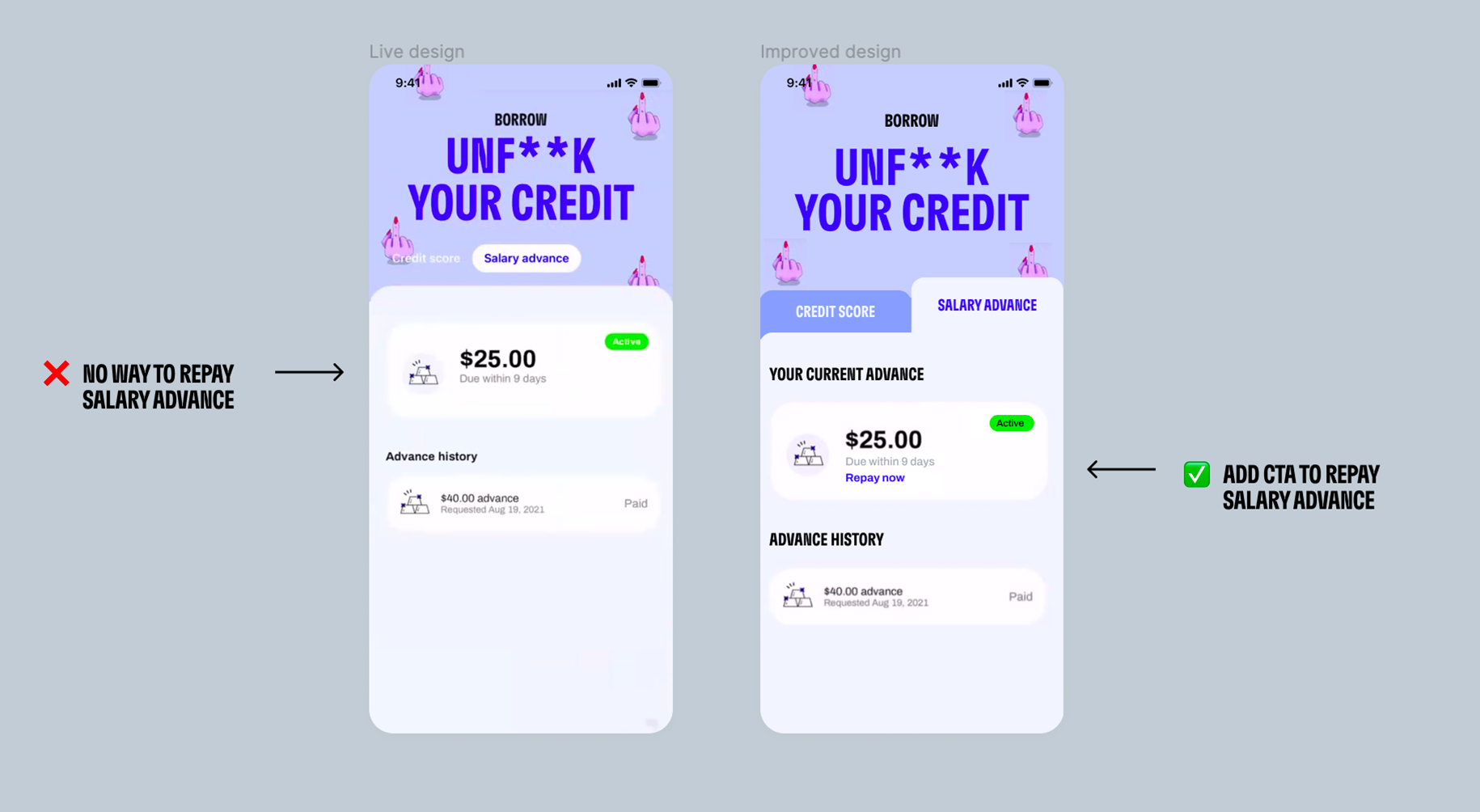
Quick fixes
As a priority we decided to focus on quick fixes that would improve the user experience, remove friction and reduce the number of customer service tickets. Dev team was also limited at this time. Here are just some examples of the changes we made.
Project #2
Boosting conversion:
Why are subscribed users lapsing?
In classic startup fashion, I was pulled from working on the Borrow Tab audit and moved onto a new project - Lapsing Users. Cleo was getting ready for another round of funding and needed to boost their number of subscribers.
Data was showing that Cleo had alot of users who had initially subscribed but were missing their monthly payments or not engaging with the app anymore. My squads job was to find out WHY and see if we could get these users to become active subscribers again.
Step 1:
Understanding the subscription journey
The other designer on the team had already started mapping the the subscription and cancellation flow with the backend devs. The first step was, as a squad, understanding how the system worked and using data to understand where best to focus.
↑ Backend subscription system (mapped by other designer on the team)
Step 2:
Co-facilitate a squad workshop
I mapped out the whole user experience of users subscribing, payments being missed and cancellations. Then with my squad and another squad we used empathy mapping.
Together we identified key issues, which skillset would be required to fix the issue, and and which squad would lead that change.
↑ Stickers for the empathy map
↑ Empathy mapping the subscription flow
Step 3:
Choose area of focus
After two squads researched (through data analysis, user interviews, UX audit, and squad workshops) what could be the reasons for users becoming lapsed the top conclusion and area that became the focus was…
📝
Focus problem
Users wanted to continue using Cleo - the app was helping to slowly reduce their debt through budgeting and using the Salary Advance feature to avoid overdraft fees. However, as most Cleo users live hand-to-mouth their Cleo payment was going out on days too far away from their payday.
Cleo doesn’t take payment if it means the user will go into overdraft) and Cleo doesn’t try to retake the payment when their account had more funds.
Therefore users were missing their payment and becoming Lapsed users.
❌
✅
Focus solution
Align Cleo subscription payment with users payday. Cleo’s Ai already has this information and predicts with 98% accuracy when a users pay day is.
Step 4:
Identifying access points
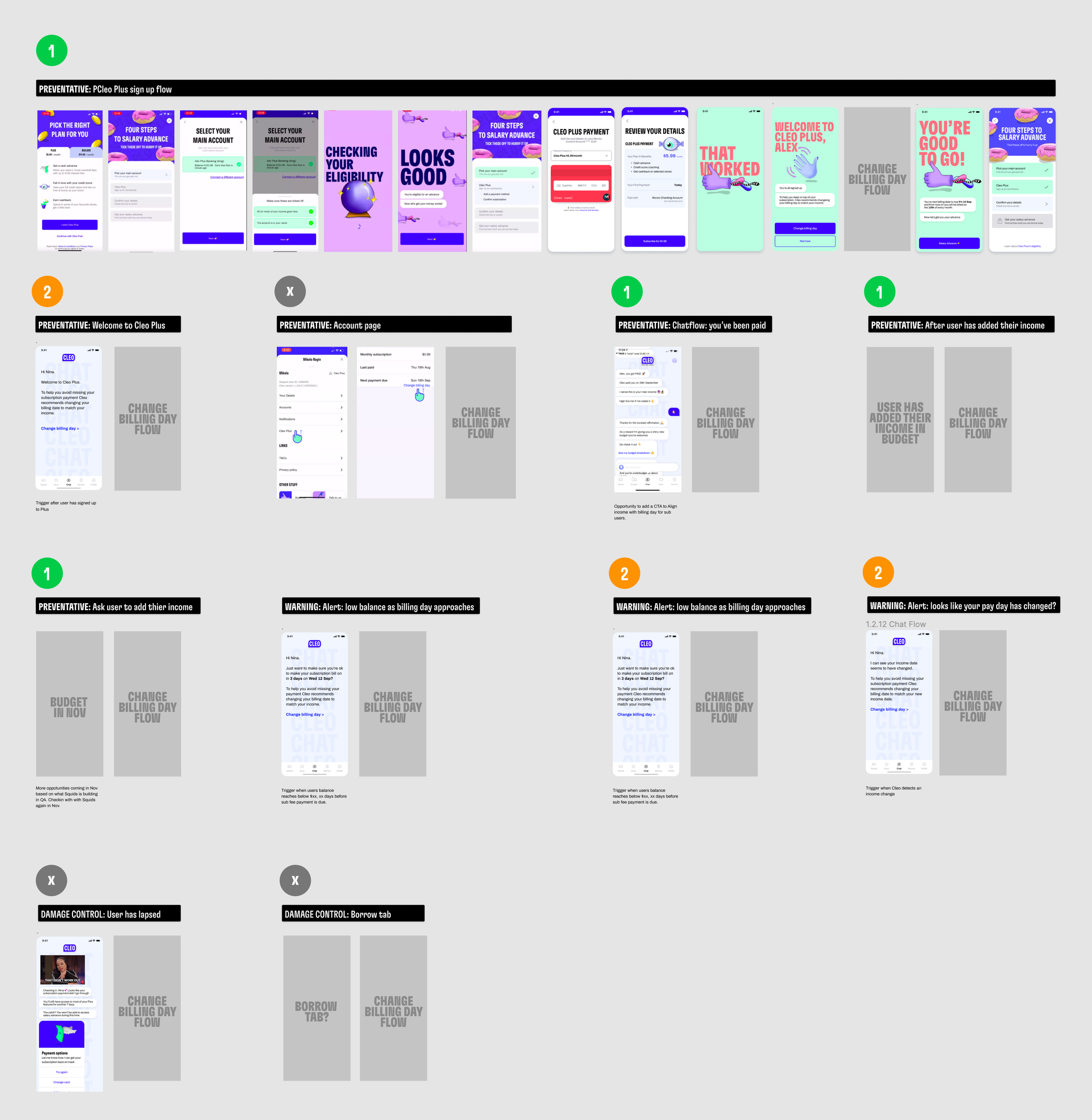
Now the goal was clear (align Cleo subscription payment with users payday) I started by mapping out all areas of existing app where it would make sense to add this new feature. Together with my Squad we then prioritised which flows to start with based on how much impact we thought it would have on reducing the numbers of lapsed users.
Step 5:
Design the new flow
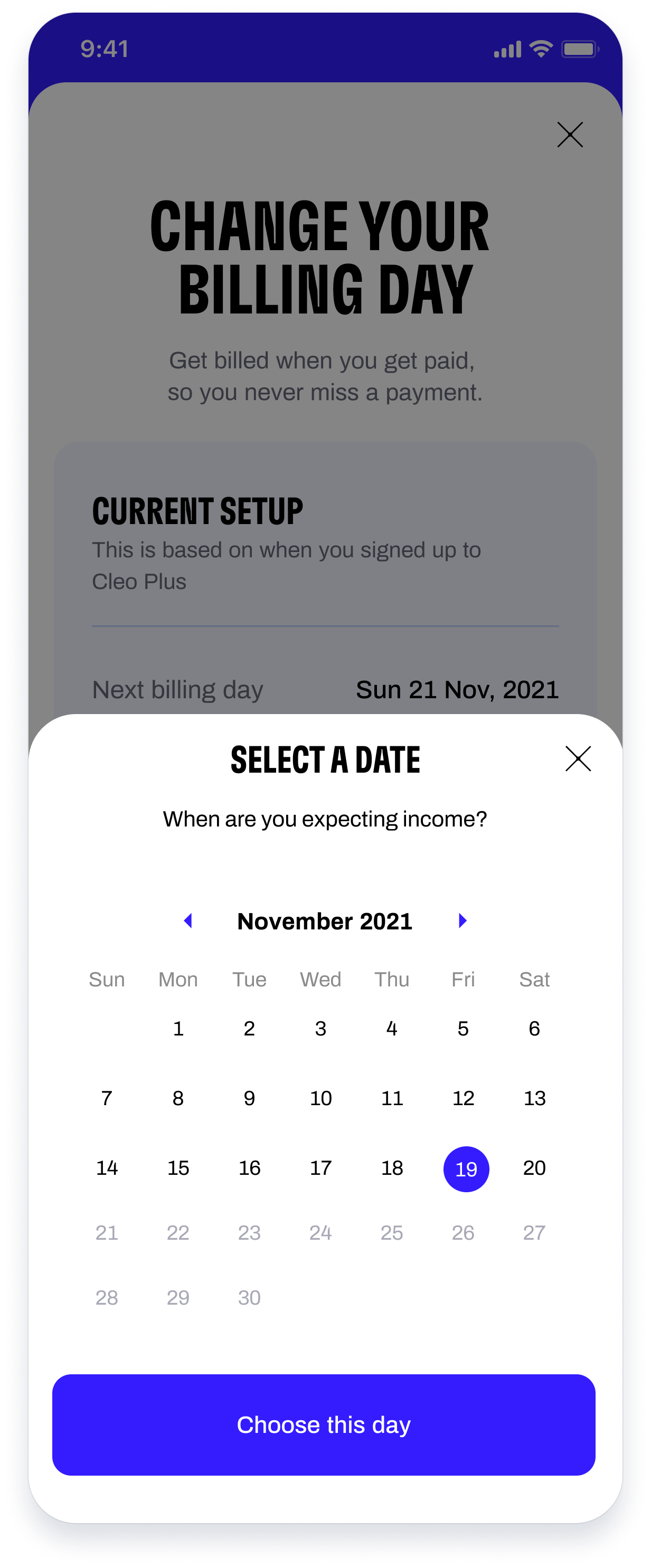
Now we knew the entry points, it was time to design the new screens. The idea was to design a ‘change your billing day‘ module which could easily slip into any flow. This meant we would only have to design and build once and it created consistency for the user.
Below shows some of the user case designs. The designs also went through multiple variations and were edited based on team feedback initially and then based on user interview feedback.
Examples of user scenarios to consider:
Signup flow - New users with income detected by Cleo
Signup flow - New users with no income detected by Cleo
Chat flow - New users with income detected by Cleo
Chat flow - New users with no income detected by Cleo
Lapsed user - cannot edit billing day
Lapsed user - cannot edit billing day, next predicted income is after default billing day
Active user - income changed
Active user - income changed to no income
Lapsed user - income detected
Lapsed user - no income detected
😊 Happy path example
User has income and Cleo has payday prediction is correct
Entry point
Change billing day screen
Confirmation message based on entry point
😔 Unhappy path example
User has income but wants to change Cleo’s suggested payday
😔 Unhappy path
Cleo is unable to detect any income because user has not connected their bank account yet
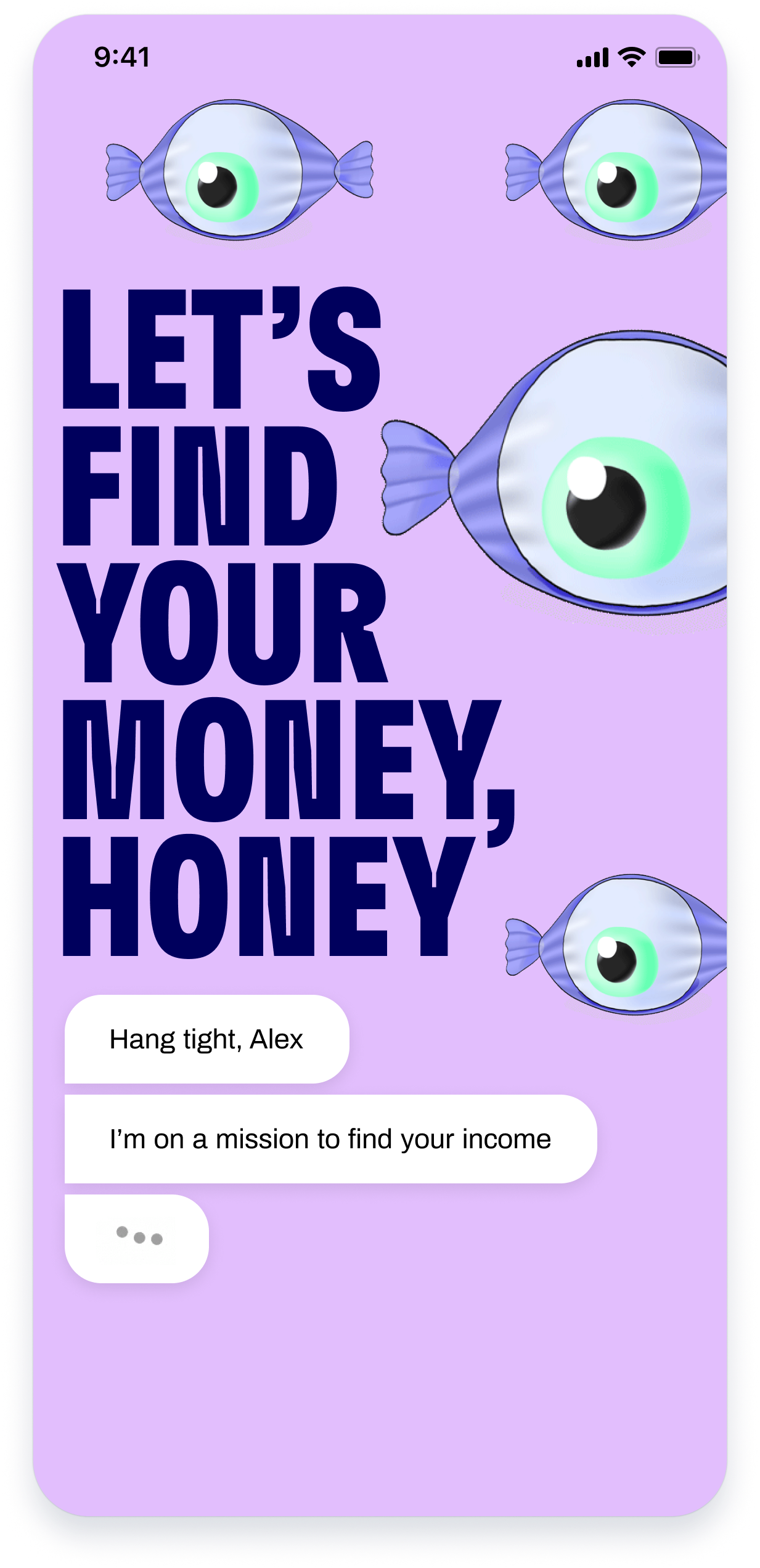
It takes Cleo’s backend 40 seconds to connect a users account. Instead of telling the user to come back later, (and potentially loosing them) I designed a flow using Cleo’s sassy personality (loved by users) to create an engaging 40 second distraction while they waited for their account to connect.
Tap on design below to see Figma prototype in action ↓
New date selected
Confirm new billing day set up
Confirmation message based on entry point
New date selected
User needs to connect their bank account
Add account flow (already exists)
Entry point
Change billing day screen
Chat while backend connects
Chat while backend connects
Chat while backend connects
Chat while backend connects
Chat while backend connects
Chat while backend connects
Happy path: account connects
Change billing day
Chat while backend connects
Change date
If users account does not connect or no income is found the following flow shows…
Chat while backend connects
Sad path: account doesn’t connect
Add account flow (already exists)
New user example: scenario 1
User has just successfully subscribed to Cleo Plus. I designed a new prompt encouraging them to change their billing straight away.
User has now subscribed to Cleo Plus
Change billing day flow
Confirmation of new billing day
New user example: scenario 2
User decided not to change their billing day during the subscription signup process. We created a new prompt in the Cleo chat to encourage them to make this change.
Chat prompt: welcome to Cleo Plus
Change billing day flow
Confirmation of new billing day
Step 6:
Facilitate user testing
I would first run my designs past my squad for feedback and to make sure what I had designed was meeting the business goals and was also possible in terms of build and lead times. I would make any changes. Then I facilitated user testing using Figma prototypes with real users based in the USA. I went through this process twice before sending the designs to the developers for build.


